
Choosing Tie Dye Colors
I think one of the fun things about tie dyeing is trying various color combinations together on a shirt. I know though that choosing colors that go together can be very intimidating to some people. So hopefully I can help take some of the stress out of choosing colors.
Let’s go over a little bit of color terminology before we get into how to choose colors.
The 3 primary colors of tie dye are fuchsia, turquoise, and lemon yellow. When you are dyeing with liquid dye, it mixes very much like paint would. Therefore, fuchsia and turquoise would mix and form purple. Fuchsia and lemon yellow would mix and form orange. Then lastly turquoise and lemon yellow would mix and form green. The colors mixed from combining 2 primary colors are called secondary colors (purple, orange and green).

Primary Tie Dye Colors
Tertiary colors are colors formed by mixing 1 of the primary colors with 1 of the secondary colors. For example: a teal color might be formed from mixing Turquoise and green, or lime green might be formed from mixing Lemon Yellow and green.
It is important to remember that when you choose dye colors for a shirt they will probably mix on the shirt if they are next to each other. Therefore, you need to choose colors that will blend well together. Dye colors that don’t blend well together will form brown areas on the shirt.
It’s a good rule of thumb to remember that you can put primary colors next to each other without any difficulty. However, you can not put secondary colors next to each other without them forming brown.
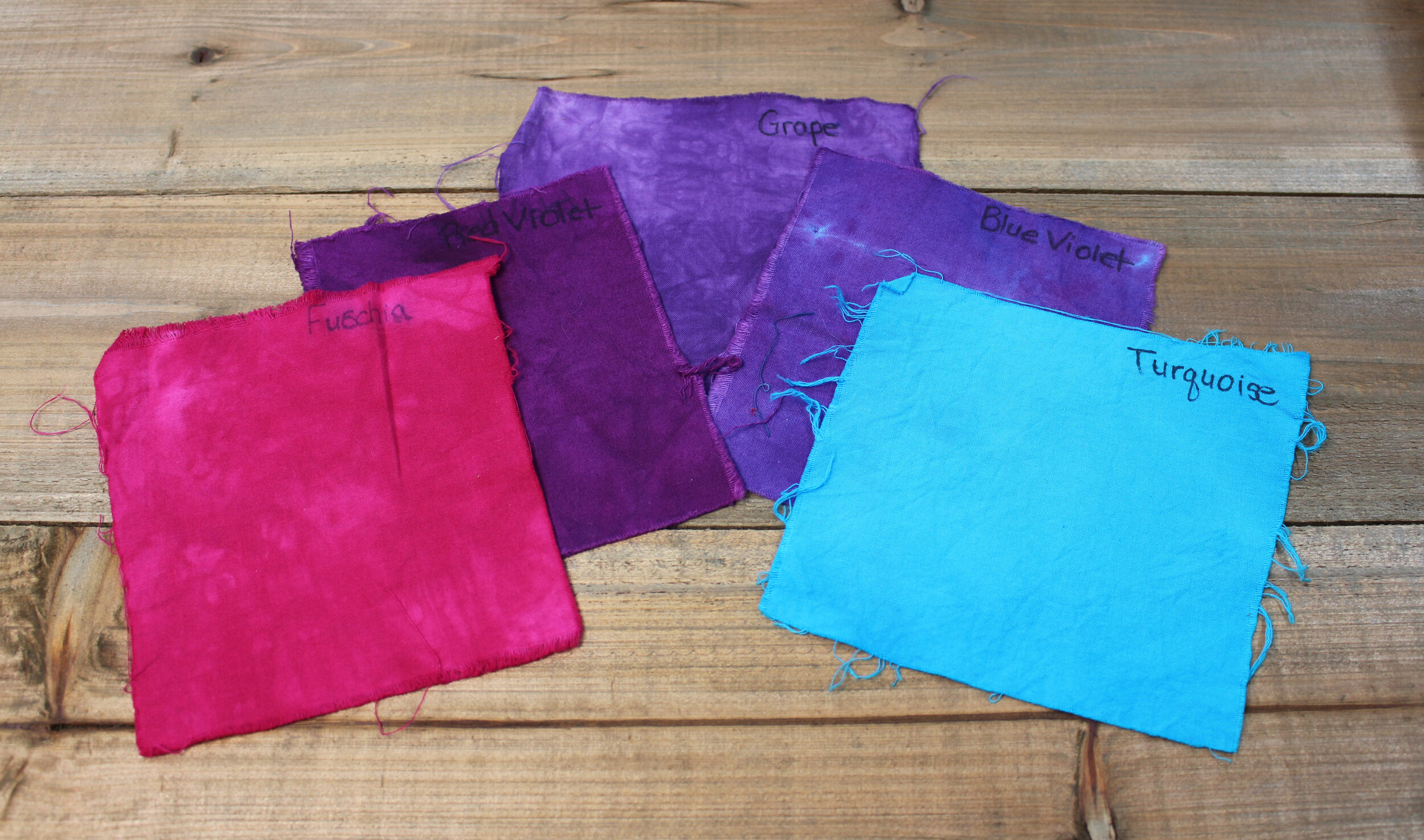
If you have a color wheel or can print one off from the internet, you may find that helpful in choosing colors. For example: Analogous colors are colors that are beside or adjacent to each other on the color wheel. Analogous colors will blend well together and will be very pleasing to look at. For example: on the color wheel purple has blue-violet and turquoise on one side and red-violet and fuchsia on the other side. You could add all 5 of these colors on a shirt together and they would look beautiful together.
An example of Analogous colors
Complementary colors are colors that are opposite each other on the color wheel. Complementary colors will give high contrast to your shirt. However, most complementary colors will form brown when combined. Yellow and purple are an example of a complementary color combination. It will be high contrast and catch your attention, but if you don’t apply them carefully you will end up with unwanted brown areas on your shirt where the two color meet.

An example of contrasting colors
Dharma Trading Company as well as most of the other dye suppliers group their colors together in color families on their websites. They usually put the blue shades that they offer together as well as the purple shades, pink shades, oranges, etc… This can make it easier sometimes because you can sort of get a sense of where the color will fall on the color wheel based upon the colors around it. For example - Dharma’s Pagoda Red is in between Tangerine and Jungle Red on their color chart. In my opinion, Pagoda Red leans more toward darker orange than it does pure red. That would make sense since it is right after Tangerine which is an orange color. Therefore, I usually use it as a darker shade of orange instead of red. If I were to mix Pagoda Red and Grape next to each other on a shirt, I would probably end up with some brown forming where the two colors touched.

Pagoda Red
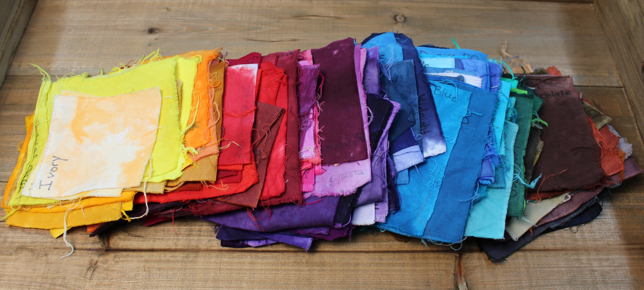
To get a feel for exactly what a color looks like - I like to make liquid dye color swatches for each of my colors when I purchase a new color. I usually mix a small amount (1/4 - 1/2 cup of the dye) and make color swatches from 100% cotton fabric. I have so many dye colors that I sometimes feel lost without my color swatches. It is difficult to tell the subtle differences between colors in the same family (like the different blues, greens, etc…) without having color swatches to refer to. When choosing colors for a shirt, I will pull my swatches and mix and match them until I find the perfect color combination.
My color swatches
You can mix your own colors using the primary colors of dye. However, I usually don’t do this very often. Since I make tutorial videos it is easier to stick to using colors that can be purchased and don’t have to be mixed. That way if someone would like to make the shirt in the video, they can refer to the links below the video in the description for the colors of dye that were used.
If you choose to mix your own dye, keep notes on the exact amounts of dye that you used to mix the color in case you would like to try to replicate it in the future. I learned my lesson with that one painting a bathroom one time. I mixed a wall color that I loved, but I ended up having to repaint the entire bathroom because I ran out of paint and couldn’t replicate the color exactly.
If you would like to learn more about mixing your own dye, Paula Burch has some more information and a mixing chart on her webpage. http://www.pburch.net/dyeing/FAQ/procionMXcolormix_overview.shtml
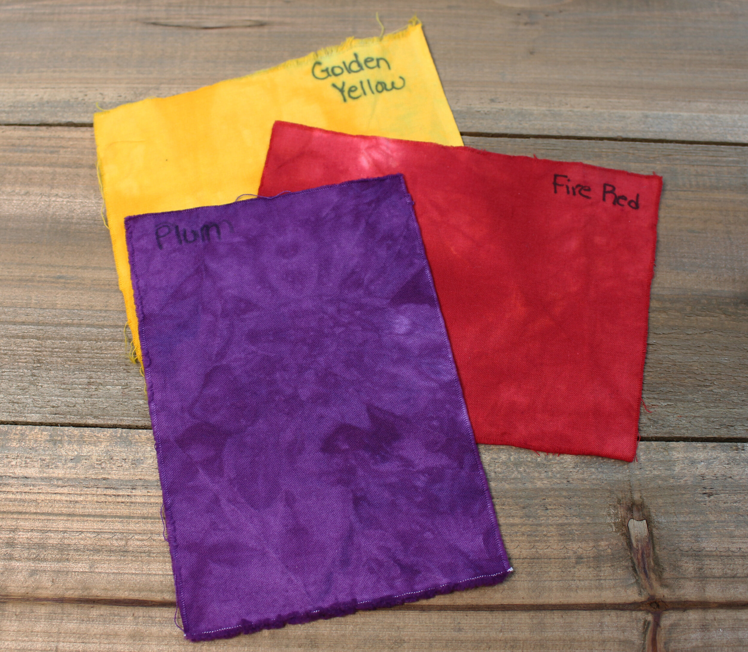
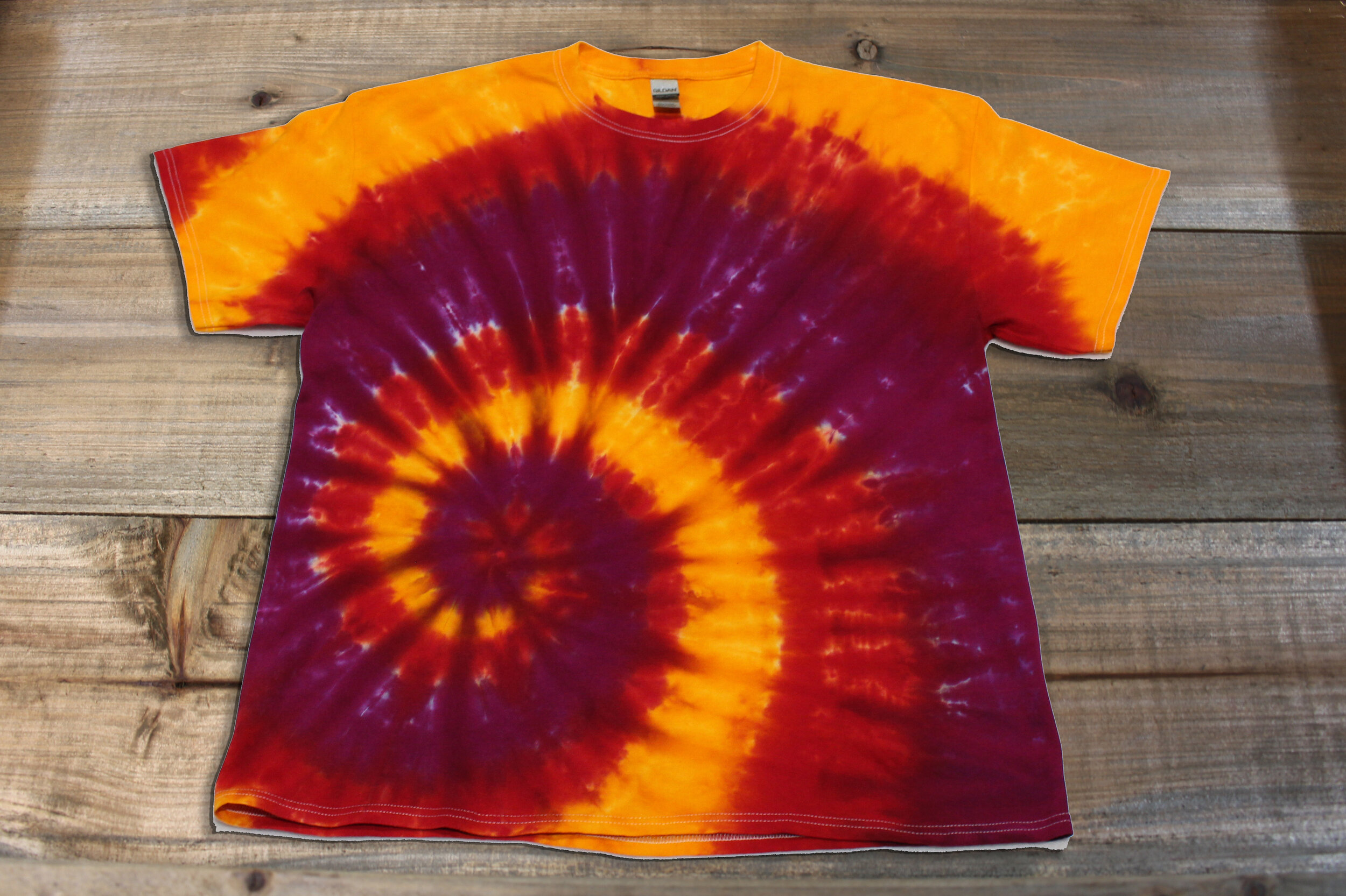
Let’s play around with pulling some color swatches for shirts. I recently made a shirt and used Plum, Golden Yellow and Fire Red from Dharma Trading Company. It was part of my Halloween Spooky Spiral series and so I wanted the colors to be high contrast. However I didn’t want a lot of brown on the shirt. To avoid the brown that might be formed from mixing Golden Yellow and Plum, I added Fire Red in between the two colors. If you notice the red is on either side of the Plum and there is no brown on the shirt. That’s because the Fire Red helps keep the Golden Yellow and Plum from touching each other and mixing to form brown.
Another color combination that works well is to choose colors from different color families and add in an earth tone. For this combination, I chose Marigold, Forest Green, Cobalt Blue and Bronze. Since yellow and blue make green - the combination of Marigold, Forest Green and Cobalt will all work well together. Bronze is the earth tone that will blend well with all three of the other colors. With this color combination, you can add the colors in any order and you won’t have an issue with unwanted brown. Bronze is in the brown family, but any brown color formed by mixing Bronze with any of the other three colors will look natural on the shirt and work well.
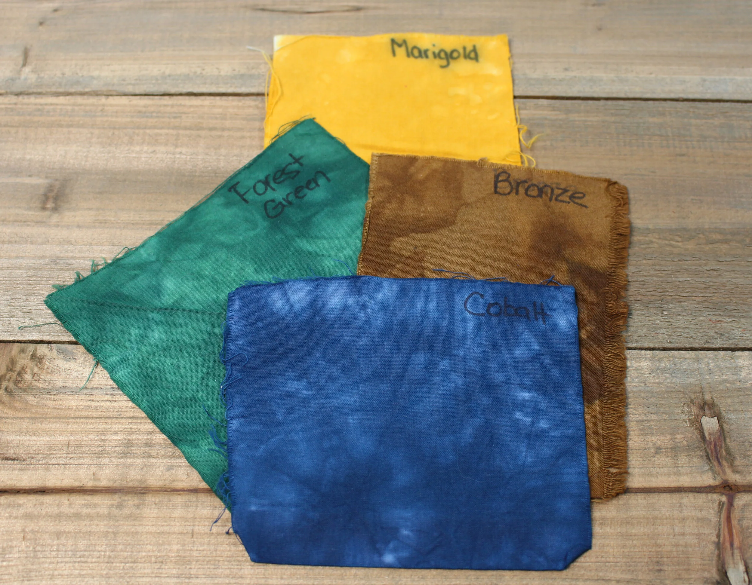
Three colors and an earth tone
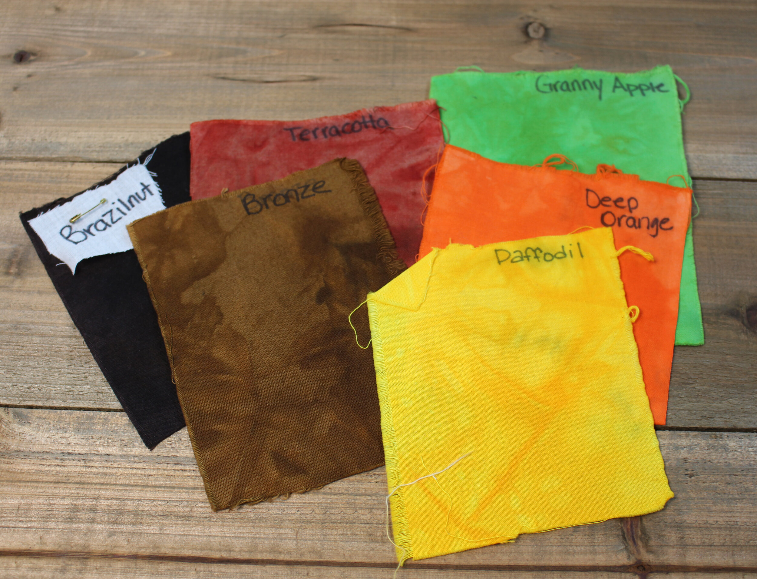
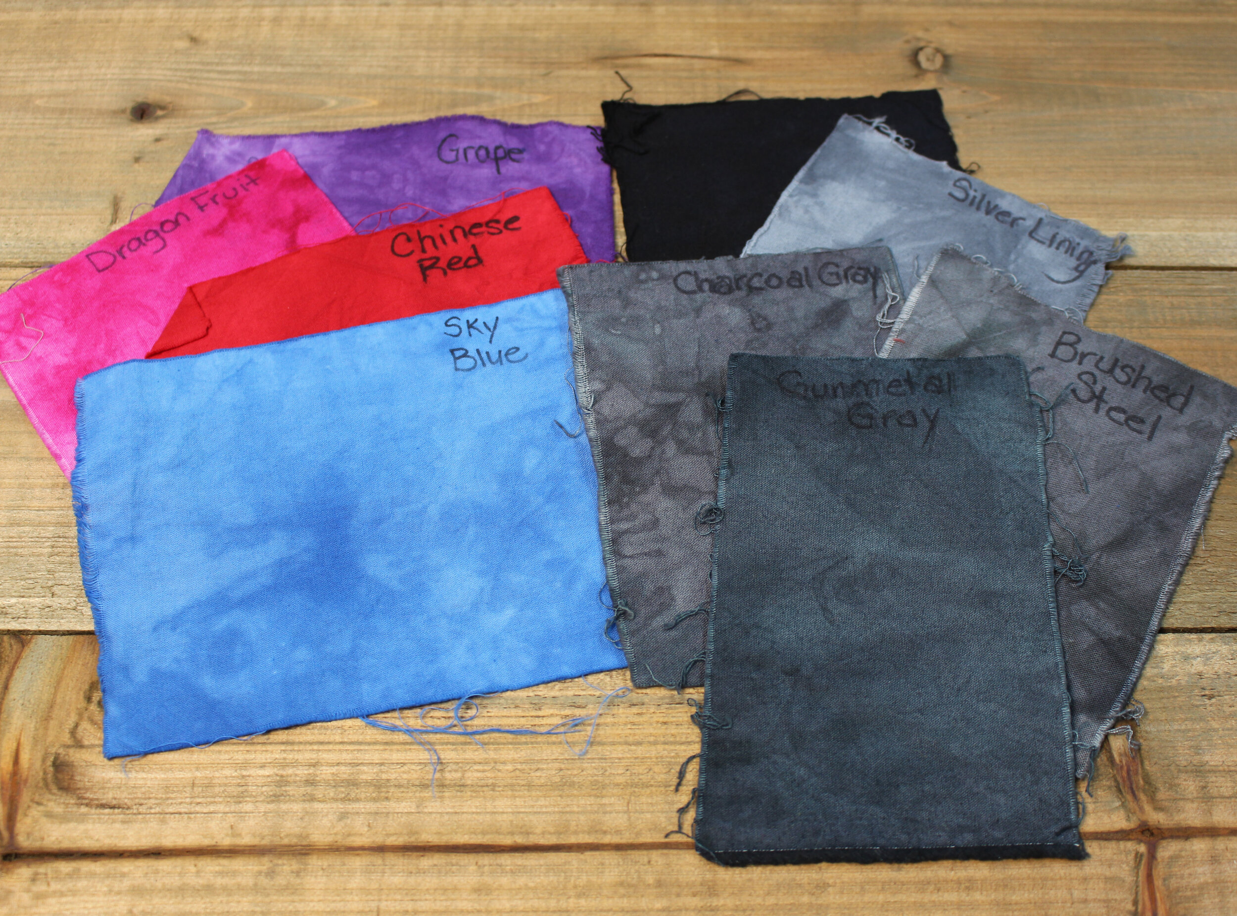
In general I use brown, gray and black shades as neutrals. I think that dye shades that are in the brown family look really good with green, orange and yellow. If you look at Dharma’s color chart the brown shades start right after the green shades. Several of the brown shades toward the middle of the list have an orange tint and the ones toward the end have a yellow tint. I’ve added some photos for an example. Since Terracotta is very red, I personally wouldn’t use it with green, at least not the Granny Apple Green that I’ve shown in the photo. I mix gray shades with red, purple, pink and blue a lot. In the photo I’ve shown some of my favorite Dharma Trading Company grays. I honestly love them all though. Black works great with any color. The photos are just an example - brown, gray and black will go with virtually any color. The Bronze and Brazilnut that I’ve shown in the photo on the left both look really good with purple, pink, red and blue too. In turn the gray colors in the right photo go really well with green, orange and yellow.
I also like to use black and brown as buffer colors. What I mean by that is, if I have colors that I know are going to blend on a shirt and form brown, I will purposely place either brown or black in that area. For example: I’ve made several Halloween shirts using the color combination of Deep Orange, Lime Pop and Grape. None of those colors blend well together, but they are great Halloween colors. So to avoid getting a lot of brown on the shirt, I added a line of black in between the colors. The black divides the colors and with this particular color combination, it helps make each of the colors stand out more. I think black dye is a great contrast color that makes most colors really pop.
I use this trick a lot. I normally use black as a buffer color, but it works too to use brown. Depending on the color combination you are using you can also use other colors as buffer colors (like gray, navy, etc…).
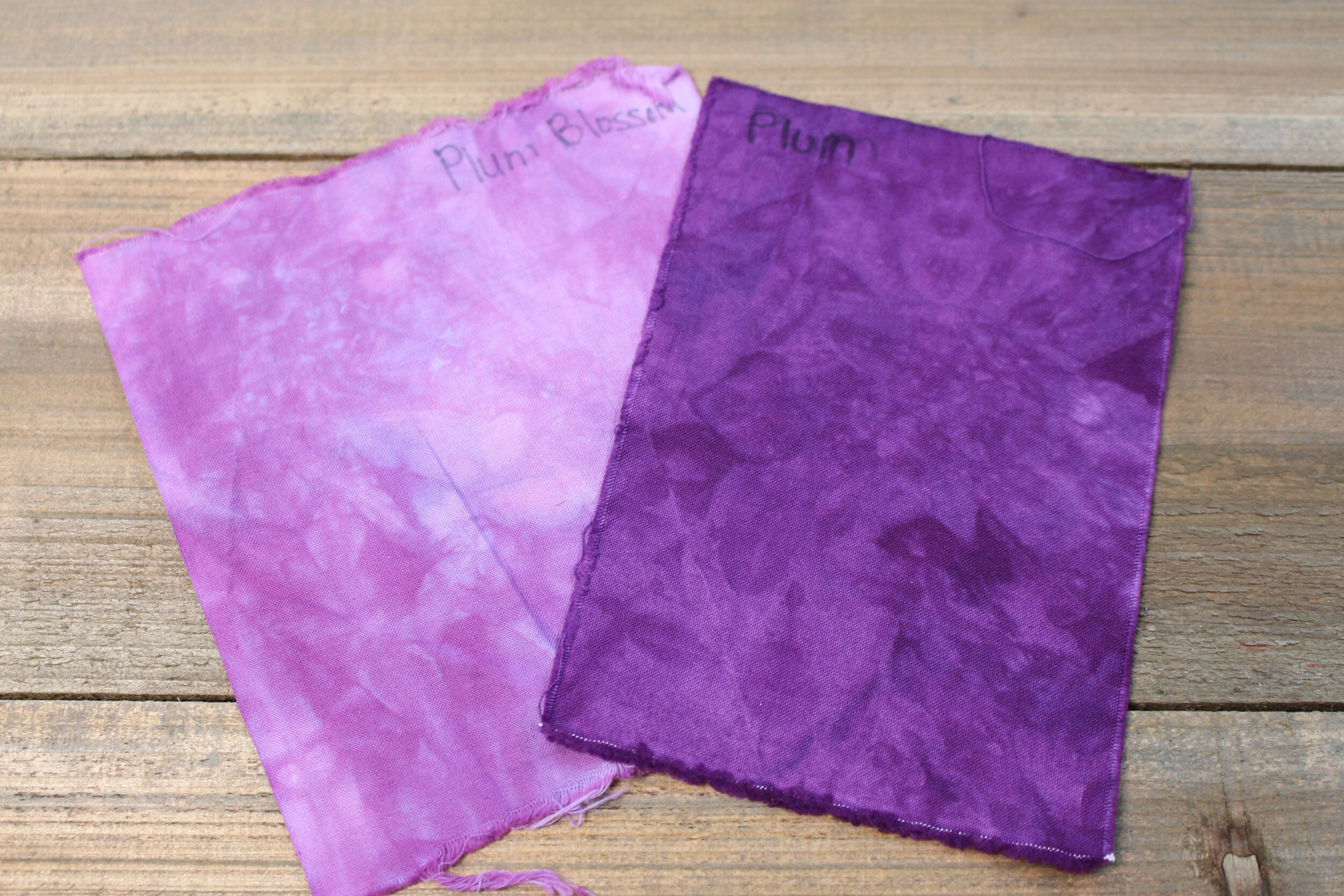
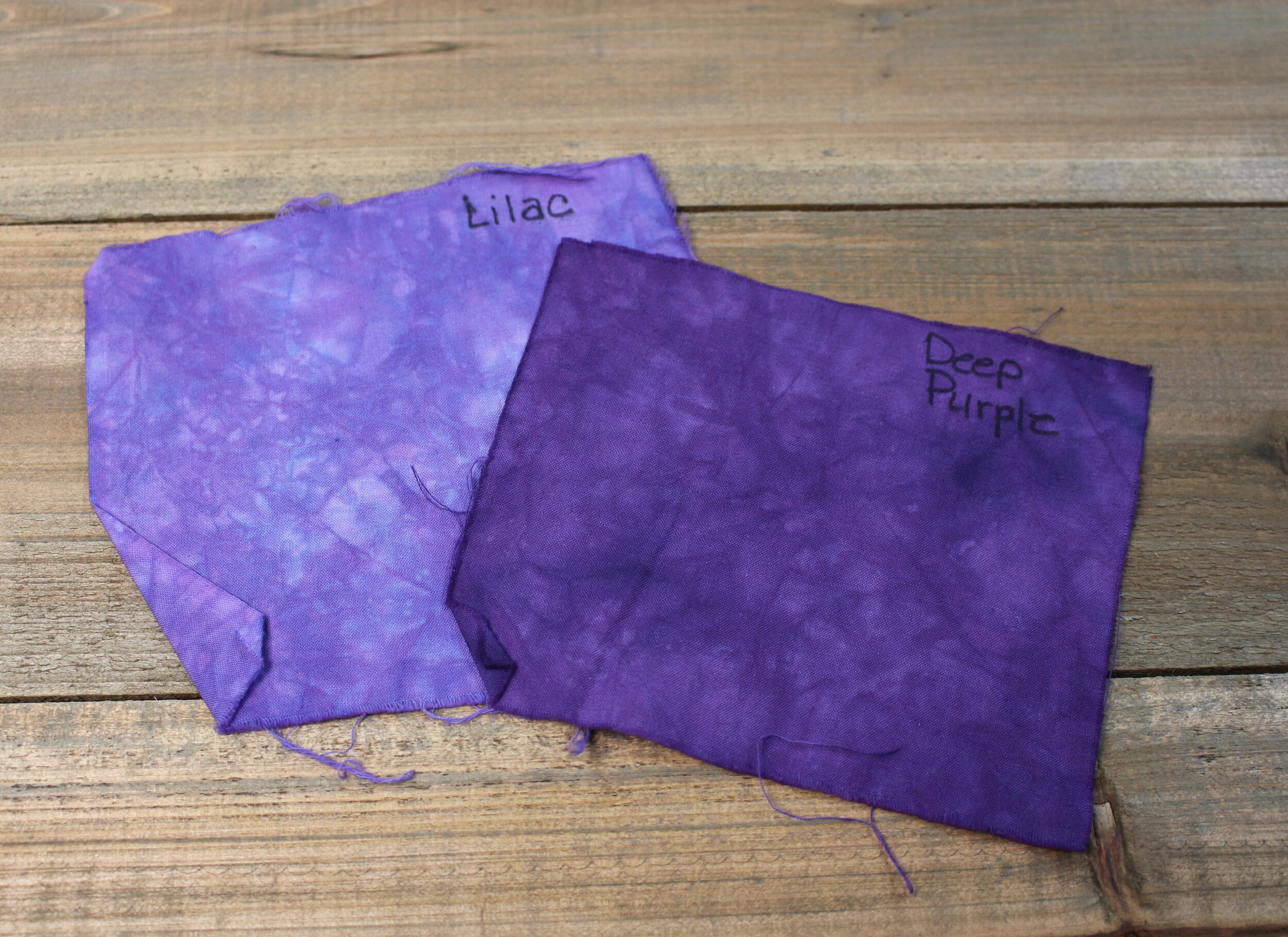
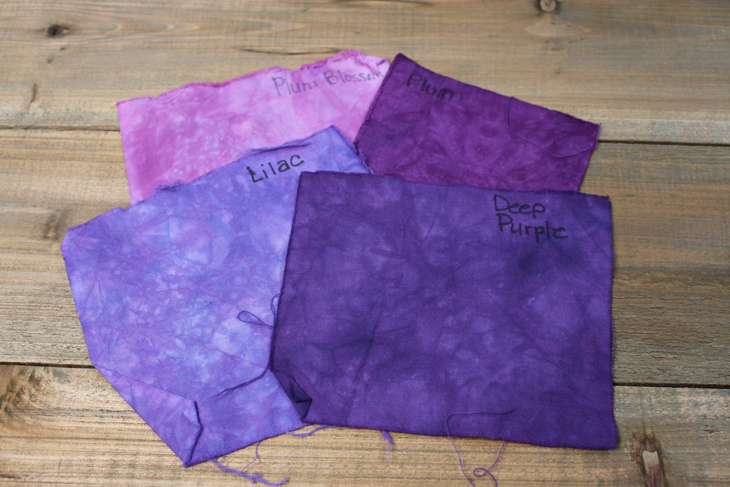
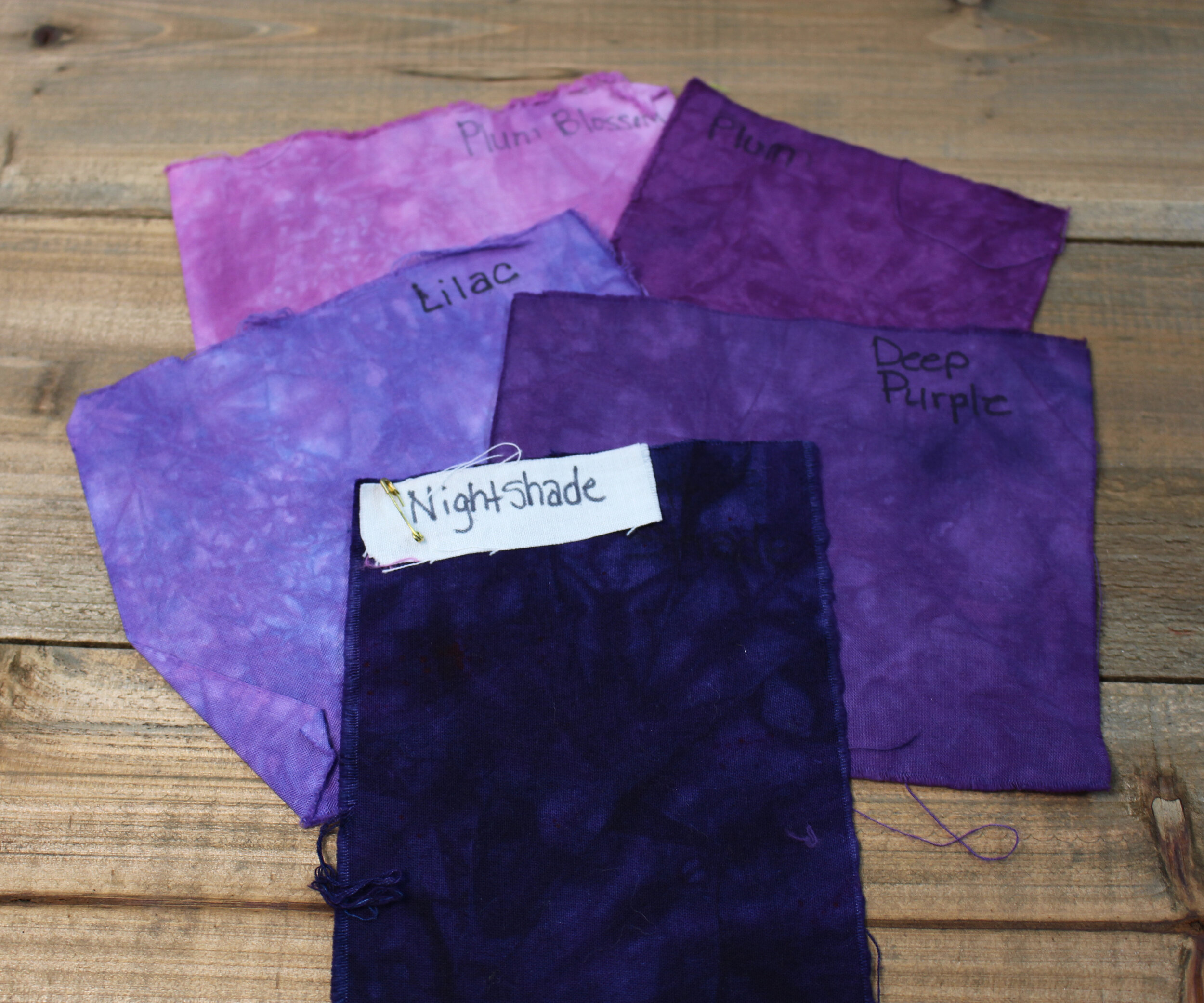
It is also fun to mix colors in the same family. The photo on the left is Plum Blossom and Plum. Notice how they are both in the purple color family, but the Plum Blossom is lighter. They are both more of a red purple too. The next photo shows Lilac and Deep Purple. They are both in the purple color family too, but they are more blue purple. The next photo shows how they would all look together…beautiful! If you would like a dark pop on your shirt, it would be pretty to add Nightshade which blends really well with all the colors.
The colors that I’ve used above in my examples are all Dharma Trading Company colors. I purchase dyes from several other suppliers though (Grateful Dyes, Prochemical and Dye, Custom Colours, and Dyespin) and sometimes the colors with the same name don’t look the same. In the photo below the color on the left is Bright Green from Grateful Dyes and the one on the right is Bright Green from Dharma. Both colors are really pretty, but the Grateful Dyes one is more yellow where the Dharma one is more blue. This is a great example of where a color swatch is very helpful.

Above I’ve mainly been referring to choosing colors for liquid dyeing. Ice dyeing is very similar, but I’ll cover it in a separate blog post since there are a couple other factors to consider when choosing colors for ice dyeing.
Hopefully the information above has helped to make you feel more comfortable experimenting with different colors and trying out unique and fun color combinations.